Arduino and Genuino brand refresh, design insights
Arduino and Genuino brand refresh, design insights
– July 20, 2015

A few months ago we introduced Genuino, Arduino’s sister brand for products sold outside the US. TODO, the design agency that developed the Arduino branding language since its early beginnings, created the new Genuino look & feel and signature elements. This new branding language is going to be applied to all Genuino and Arduino products in the near future.
Giorgio Olivero, one of TODO co-founder, studied at the Interaction Design Institute Ivrea, where Arduino was conceived. Giorgio and later on his team (among others Vanessa Poli and Alessandro Argenio) have been taking care of Arduino’s brand identity since then. We have asked Giorgio to tell us the reasons behind the original Arduino branding language, and the Arduino/Genuino design language refresh. Here is the story in his own words:
‘ When we began developing Arduino’s identity in late 2009 we wanted the project to feature an accessible, pop, and clear communication language for the new community that was growing around DIY electronics. Something that wouldn’t compare to the technical-macho look of the engineer-oriented platforms and products: a testosterone-free positioning that could speak to everyone and not only to experts and hard-core enthusiasts.
Arduino’s original visual language had to stand out and define a yet uncharted market, its goal was to ‘declare, define, simplify’ without scaring people away with overly technical details. Arduino’s identity had to be true to its community values, not too polished but still elegant and accessible. It was basic, technical and playful. The message was: Arduino is a modular system open to anybody and in constant evolution.
As the electronics market keeps evolving at an incredible rate, it’s about time to refresh both the Arduino and the Genuino brand with an updated system. The new design keeps a strong continuity with the previous one, we see it as an evolution rather than a revolution. We want people to recognize that the core values and the ‘personality’ haven’t changed. The new recipe is spicier and less technical though, it has a sort of circus-like feeling: it’s about the joyful interplay of the Arduino ecosystem and community. You could see these colourful squares as different components, circuits, and modules of an electronics system. Or rather as the interlocking building blocks of the maker movement itself, that recipe of openness that makes Arduino so unique.
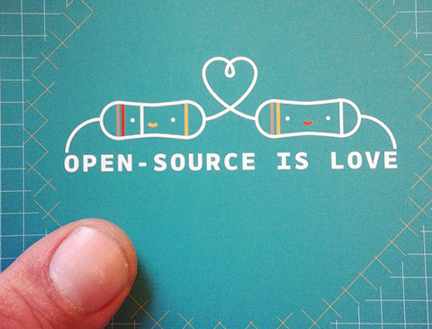
The new visual language evokes empathy, joy, and playfulness.
Collaboration is its core value. It introduces a series of characters
based on the electronics components with a playful personality, that
will enable new outlets for the visual identity.
We have always enjoyed working with Arduino, our ongoing collaborations (and long friendship) surely requires very fast design iterations, because the Arduino ecosystem keeps evolving, but hopefully we are making the brand stronger and very well equipped for the new challenges ahead.’